Español

How to highlight miniatures using soft glazes
- 07/18/2026 16:43:47
- Home , Assembly and Painting Guides
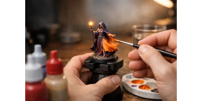
Too thick of a highlight can ruin a perfectly good transition in seconds. Knowing how to highlight miniatures with glazes allows you to build volume on a cloak, armor, or creature without leaving those typical, harsh color steps. It is not a fast technique at first, but it is one of the most reliable ways to take a miniature from a good tabletop standard to a piece with real depth.
The glaze does not replace traditional highlights. It organizes them, softens them, and corrects their edges. It works especially well on organic surfaces, cloaks, skin, cloth, vehicles with large panels, and any area where the light needs to shift from shadow to a bright spot without visible cuts.
What a Glaze Does When Highlighting a Miniature
A glaze is highly diluted paint applied in thin, controlled layers. Unlike a wash, its goal is not to settle into the recesses. Instead, it aims to gradually alter the tone of a specific area. Each pass leaves a minimal amount of pigment; as you repeat the process, it builds the transition.
To highlight, you concentrate the lighter paint near the point that receives the light. The key is for the brush to deposit more pigment where you want the light to be intense, and to arrive almost dry at the edge of the transition. This way, you do not cover the previous color—you tint it.
This explains why a well-executed glaze can fix a harsh highlight. If you applied an intermediate highlight with an edge that is too sharp, a few glazes of the bridge color can blend both tones. However, it also has a limit: if the initial contrast is too extreme or the highlight is placed in the wrong spot, it is better to repaint part of the area rather than insisting with twenty translucent layers.
Materials and Mixing: Less Paint Than It Seems
To work with glazes, you need acrylic paint, clean water, a wet palette, good-tipped brushes, and paper towels. A glazing medium or an acrylic thinner can help maintain the paint's binder when you dilute it heavily, though it is not essential to get started.
The exact ratio is not universal. It depends on the brand, the color, and the pigment coverage. As a starting point, try one part paint to three or four parts water or medium. The mixture must be translucent but still retain some pigment. If it looks like colored water and you need ten passes to notice a change, it is too diluted. If it covers completely in one pass, it is not a glaze.
Light, opaque colors—especially ivories and yellows—usually require more care. Pure white can leave chalky marks and dull the saturation of the base color. In most cases, it is better to highlight with a lighter, warmer tone of the existing color: beige for leather, pale yellow for red, grayish-blue for steel, or light flesh for skin.
Before touching the miniature, unload the brush on a paper towel. It should be damp, not loaded. If you see a bead of water in the belly of the bristles, you have too much mixture. This step prevents rings and pooling in the folds.
The Palette Test Is Not Enough
A glaze can look perfect on a smooth palette and behave differently on a matte primer or a textured surface. Test it on the back of a cloak, under a base, or on a test miniature. Check how much pigment it leaves behind when it dries, not while it is still wet.
Acrylics usually darken or lose some shine as they dry. Waiting a few seconds between layers allows you to judge the real result and prevents the brush from tearing up the previous layer.
How to Highlight Miniatures with Glazes Step-by-Step
1. Start with a defined base and shadow. They do not need to be perfectly blended, but you must know where the light source will be. On a sword, for example, it might be the upper edge; on a cloak, the high folds; on a face, the forehead, cheekbones, nose, and chin.
2. Apply an intermediate highlight first. Make this slightly lighter than the base. This layer marks the highlighting area and reduces the number of glazes needed. Next, prepare a translucent mixture of that same color, or of a tone between the base and the highlight.
3. Move the brush from the transition area toward the brightest point. Keep the brush unloaded. Direction matters: the brush deposits slightly more paint at the end of the stroke. If you start in the shadow and finish in the light, you reinforce the bright area without muddying the dark one. In small areas, use short strokes that follow the volume of the piece.
4. Let it dry and repeat. The first two layers may look almost invisible. This is normal. The improvement comes from accumulation and precision, not from the amount of paint in a single pass. Once the gradient is smooth, apply a lighter highlight to a smaller area and integrate it again with a glaze of the intermediate tone.
5. Keep the final highlight tiny. A dot of ivory on the edge of a shoulder pad, a fine line on an edge, or a small mark on the nose is enough to create the illusion of shine. If you cover half the area with the lightest color, the volume disappears, and the miniature will look flat under tabletop lighting.
Adjust the Technique to Each Surface
-
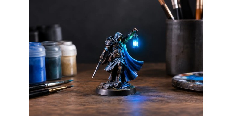
Cloth and cloaks: Follow the direction of the folds. The glazes should reinforce the crest of each fold, not fill the entire surface equally. If the cloth is red, an orange-red highlight will maintain intensity; going straight up with white tends to create pink, which only works if you want a faded fabric.
-
Skin: Glazes serve both to highlight and to introduce variation. A very thin, warm mix on cheeks, knuckles, or elbows makes the skin look less uniform. For highlights, work with progressively lighter flesh tones and reserve near-white dots for highly exposed areas. Apply the same criteria for green, blue, or fantasy skin: color temperature also models volume.
-
Armor: This requires a prior decision. For Non-Metallic Metal (NMM), glazes are essential because the bands of light and shadow must be strictly controlled. For metallic paint, they help tint reflections and shadows, but you should keep some sharp highlights with lighter metallics. A completely glazed steel can lose the specular contrast that makes it look like metal.
-
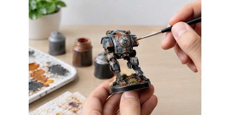
Vehicles and scenery: Work panel by panel and avoid overly uniform coats. A light glaze in the center of a plate can suggest sun bleaching, while a dark one near rivets, joints, or lower sections adds depth. On large pieces, use a slightly larger brush to avoid leaving a texture of small brushstrokes.
Frequent Mistakes and How to Fix Them
The most common mistake is confusing a glaze with a wash. If the color runs into the recesses, the brush carries too much mixture. Unload it more and apply less liquid. If a ring has already formed, let it dry completely and smooth it out with very thin glazes of the base color around the edge.
Another problem is pushing paint around while it is still wet. This can result in a rough surface or torn layers, especially on low-resistance primers. Work patiently: a thin layer dries quickly, and that waiting time saves you from having to repaint.
You should also watch your saturation. Highlighting does not automatically mean adding white. If a blue tunic needs a clean, cold light, a light blue or a blue-gray might be better than white. If you want a warm sunset light, a touch of pale yellow or light flesh will make more sense. The choice depends on the atmosphere of the miniature and the lighting of the army or base.
Finally, do not try to solve every transition with glazes. On gaming miniatures, a solid base, stark shadow, and two clean highlights usually read better from a distance than a delicate gradient without contrast. Reserve the finest work for characters, monsters, commanders, or display pieces.
A Useful Exercise to Gain Control
Paint a shoulder pad, a flat shield, or a cloak on a test miniature with a mid-tone. Place a visible shadow on one end and a bright highlight on the other, even if the jump is harsh. Then, use glazes of the mid-tone to reduce the edge between both tones, always moving toward the light.
Repeat the exercise with three combinations: a warm one, a cold one, and a highly saturated one. You will quickly learn that not all pigments dilute the same way, and that a correct highlight depends just as much on position as it does on the chosen color.
When glazes stop feeling like a rescue maneuver and become part of your regular process, you will paint with more room to experiment. A good transition does not need to be invisible from two centimeters away; it just needs to make the miniature read better, have volume, and pop when it hits the gaming table.