Español

How to decorate realistic urban bases
- 07/08/2026 21:03:10
- Home , Assembly and Painting Guides
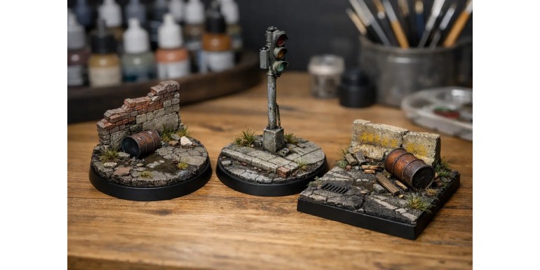
A poorly executed urban base is noticed instantly. The miniature might be beautifully painted, with fine highlights and a well-thought-out palette, but if it stands on a flat, clean, and expressionless surface, the overall piece loses its impact. That is why it is well worth understanding how to decorate realistic urban bases: it’s not about gluing down four random pieces of rubble, but about building a small scene that possesses weight, scale, and visual logic.
The key lies in thinking as if you were representing a piece of a real street in miniature. On a convincing urban base, not everything is grey, nor is everything just ruins. There is concrete, dust, rusted metal, leftover road markings, broken brick, dirty puddles, and scattered trash—but always arranged with a clear hierarchy. If you try to fit everything in at once, the base becomes cluttered and confusing. If you select two or three main materials and work them well, the final result will improve dramatically.
How to Decorate Realistic Urban Bases Without Overcrowding Them
The most common mistake is confusing detail with accumulation. An urban base needs texture, yes, but it also requires areas of visual rest. A broken section of pavement, a grate, two debris fragments, and a bit of grime usually work much better than a mountain of rubble that covers half the miniature. This is especially noticeable in 28-32mm scales, where any oversized element instantly breaks the illusion.
Before gluing anything down, it is best to decide what type of urban environment you want to depict. An industrial street, a bombed-out zone, a contemporary alleyway, or a decayed sci-fi city are not the same. The language of materials changes completely. On an industrial base, you can give more prominence to metal, plating, and pipes. On a more contemporary urban base, concrete, curbs, cracked asphalt, and remnants of road signs work best.
The role of the miniature matters too. A soldier on the move calls for a more open composition. A display figure allows for more narrative on its base. And a gaming miniature needs a tight balance between visual impact and durability during tabletop play. There are beautiful finishes that simply do not hold up well during transport if they are built with too many fragile elements.
The Base Structure: Asphalt, Pavement, and Uneven Ground
For an urban base to be read quickly by the eye, it usually helps to start with a recognizable structure. Asphalt is a classic choice because it provides immediate context, but on its own, it can look flat. The real interest appears when you introduce a second level: a pavement sidewalk, a broken curb, a manhole cover, or a half-buried metal plate.
That small change in height makes a massive difference. You don't need to raise a 32mm base by half a centimeter. Sometimes a thin sheet of cork, plasticard, or putty is enough to create a believable sidewalk. If you then break the edge with irregular cuts and a bit of texture, it stops looking like a glued-on block and starts looking like part of the terrain.
Cork remains highly useful, but it must be used with care. If left as is, the edge reveals the trick all too quickly. It works better when combined with texture paste, fine sand, or putty to seal the surface and redefine the edges. In urban settings, it is best to avoid that natural rock texture so typical of bare cork, as it ends up looking more like a cliffside than broken concrete.
Materials That Actually Fit an Urban Base
Fine sand, small debris, crushed brick, scraps of plastic to simulate junk, grates, metal sheets, cables, and well-cut fragments of sprues usually yield excellent results. The trick is not the material itself, but the scale and the finish. A piece of plastic can look like an I-beam or an absurd piece of waste depending on how you cut, sand, and paint it.
Recognizable elements do a lot of the heavy lifting to sell the effect. A curb, a circular manhole cover, a weathered road line, or a broken tile give a much stronger urban feel than ten random rocks. Because of this, in gaming and diorama projects, it pays off to work with scenery bits or accessories designed specifically for that visual language. In a specialized store like Terrainandminis.com, that difference is clear because the materials are already much closer to the scale and actual use of the hobby.
Painting: Urban Realism Is More Than Just Grey
If everything is left in the same medium grey, the base turns flat. Real urban ground features many subtle nuances. Concrete can lean towards cold beige, blue-grey, or dirty grime-grey. Asphalt is usually darker, but it is never uniform. Dust lightens some areas, moisture darkens others, and foot traffic creates different types of wear.
A good base usually starts with two color families. For example, a warm grey for concrete and a darker, cooler grey for asphalt or painted metal. From there, washes and soft filters help break up the uniformity. Desaturated browns, dirty greens, and heavily thinned earth tones work much better than pure black for adding grime. Black hardens the look too much if used without control.
Drybrushing is still useful, but in urban settings, it should be finer and more selective. If you whiten all the edges equally, the ground will look like plaster. It is better to reserve highlights for broken edges, eroded areas, and small impact points. On wide surfaces, stippling and irregular glazes yield a much more natural look.
Wear, Rust, and Grime with Purpose
Realism appears when every stain has a reason for being there. Rust originates near metal, flows down with gravity, and stains its surroundings. Dust accumulates in corners and recesses. Grease and moisture stain differently than dry dirt. It sounds obvious, but many bases fail right there: good effects, placed without logic.
If you add a metal grate, it is well worth adding some oxidation around the perimeter and not just on the piece itself. If you simulate a broken pipe, a damp patch nearby makes sense. If there is crushed brick, that reddish tone should lightly contaminate the surrounding dust. These are small gestures, but they make the scene read as a cohesive whole.
How to Decorate Realistic Urban Bases with Rubble and Trash
Rubble works best when grouped in a believable manner. On a real street, debris does not usually spread out with perfect regularity. It piles up next to a wall, at the foot of an impact site, in a corner, or around a fallen structure. If you scatter every fragment at the same distance, the base looks decorated, not lived-in.
Something similar happens with trash. A piece of paper, a crushed box, a bottle, or a torn poster can add an immense amount of atmosphere, but only if they don't steal the spotlight from the miniature. On gaming bases, one or two secondary elements are normally enough. On display pieces, you can afford a richer narrative, though it is still better to imply rather than to overcrowd.
There is also a matter of era and setting. An urban base for a grimdark setting does not call for the same type of grime as a clean modern setting or a corporate sci-fi city. The volume of debris, the colors, and the type of deterioration must complement the miniature's universe. Sometimes a nearly clean base, featuring a well-painted crack and a peeling road line, conveys more than a complete ruin.
Integrating the Miniature into the Scene
The miniature does not sit on top of the base. It goes inside the base. That distinction changes how you place every element. The pose dictates the layout. If a leg rests on a piece of rubble, that point must look stable. If the character is moving forward, it is best to leave some breathing room in front of them and concentrate more texture behind or to the side. If the base tells a small story, the direction of the gaze and the weapon also plays a role.
Another crucial point is chromatic coherence. If the figure features cold, dark tones, a base that looks too similar might swallow it up. If the color scheme is highly saturated, a more muted urban base helps balance it out. There is no fixed rule, but there is a useful guideline: the base must support the miniature, not compete with it.
In practical terms, it is well worth lightly weathering boots, cloak hems, or kneepads with the tones of the base. A bit of dust of the same color ties both parts together instantly. When the figure and the base share environmental footprints, the entire project steps up a level without the need for complex effects.
What Usually Fails and How to Fix It
If the base looks too flat, it probably lacks height variation or texture contrast. If it looks like a jumble of random waste, it needs a clearer composition. If the result looks artificial, there is almost always an issue with scale, an overly uniform color, or effects placed without logic.
It is also worth reviewing the rim of the base. A clean edge, neatly painted in black or a very dark brown, frames the scene and makes it look finished. It is a small detail, but on gaming miniatures, it makes quite a difference—especially when the rest of the base features varied textures and colors.
If you are just starting out, you don't need to aim for an ultra-complex urban base. A good combination of broken concrete, dust, weathered metal, and a narrative detail is usually more than enough. When that is well executed, the base stops being a mere support and begins to truly reinforce the character of the miniature.
The best reference remains observing real streets, industrial areas, damaged curbs, and weathered surfaces. Not to copy them down to the millimeter, but to understand why they get stained, how they break, and why they age the way they do. When you apply that logic to the hobby, decorating realistic urban bases stops being a strict recipe and becomes a highly effective tool to make each figure tell a deeper story at first glance.