Español

Realistic Finishes for Terrain Buildings
- 07/23/2026 09:30:32
- Home , Assembly and Painting Guides
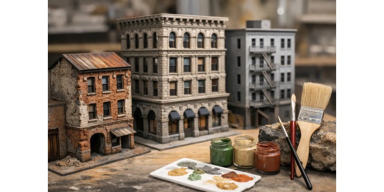
A terrain building can have an excellent silhouette and still look like it just came off a plastic sprue. Realistic finishes for buildings are what break that feeling: a wall with subtle tone variations, an eroded corner, dust accumulated around the base, or a window with depth all help the piece blend into the tabletop and give true context to your miniatures.
It is not about adding dirt without criteria. A believable finish responds to the building’s material, its environment, and its intended use. A sci-fi factory, a medieval house, and a ruined urban block require similar techniques, but applied with different intensities and color palettes. The key is layering: texture, base color, contrast, weathering, and small details.
Realistic Finishes for Buildings: Start with the Surface
Paint cannot completely replace a well-prepared surface. Before priming, inspect seam lines, cut edges, and areas that appear too smooth. Whether working with MDF, plastic, resin, foam, or foam board terrain, the texture must maintain a scale that is coherent with the miniatures surrounding it.
For concrete, stone, or plastered walls, applying a fine texture paste or putty unevenly adds realistic porosity without turning the surface into a jagged rock. Avoid applying thick layers around doors, frames, and interlocking joints: extra bulk can prevent modular pieces from fitting properly or stop a miniature from standing securely.
Brick and masonry work best when the texture is defined by the kit itself or engraved prior to painting. If you use sand, make sure to choose an extremely fine grain. Coarse sand might look fine on a monster base, but on a 28–32mm scale wall, it will look like industrial gravel. For industrial scenery, textured plasticard sheets, plastic strips, and structural profiles help create panels, rivets, cladding, and ducts with crisp, clean edges.
Primer visually unifies all these disparate materials. Black, grey, or dark brown are the most practical choices for terrain:
-
Black provides immediate shadow depth in interiors and recesses.
-
Grey makes reading cement, stone, and metal tones much easier.
-
Brown serves as an ideal base for dirt structures, wood, or warm ruins.
If the building will see frequent handling during games, allow all putties to cure completely and seal fragile materials before moving forward.
The Base Color Needs Variation
A wall painted in a single flat grey rarely looks like real concrete. Even abandoned buildings feature color shifts caused by humidity, dust, spot repairs, soot, and sun exposure. Instead of searching for one perfect shade, work within a family of closely related tones.
Over your primer, apply the main base color without worrying about covering every single nook and cranny. Next, introduce localized variations using a brush, sponge, or airbrush. On a concrete wall, you might add slightly cooler panels, lighter repair patches, or darker lower sections. On a brick facade, alternating between three or four muted red and brown shades breaks up the repetitive pattern that reveals the piece as a miniature model.
Drybrushing remains one of the most effective tools for terrain because it highlights edges and textures rapidly. It works exceptionally well on stone, brick, weathered wood, and rubble. Remember to unload more paint from the brush than usual: the goal is to illuminate relief details, not coat them in an opaque layer. Two gentle passes—one with a medium-light tone and a second, much lighter pass restricted strictly to exposed edges—yield a far more natural result than a single heavy application of white.
An airbrush drastically speeds up work on large buildings, especially for dusting gradients, smoke stains, or zenithal highlights. However, it does not replace brushwork entirely. Tabletop terrain needs details to pop from a standard gaming distance; a few selective highlights on window frames, cornices, and rubble will do more to enhance readability than a hyper-fine gradient that can only be appreciated up close.
Washes, Filters, and Oils: Each Serves a Purpose
A dark wash defines recesses and adds instant contrast, but splashing it across the entire model can dull your colors and leave tide marks. Apply washes selectively into cracks, around metal fittings, underneath eaves, and where dirt naturally accumulates.
Filters are heavily diluted, translucent layers used to shift the overall color tint without obscuring underlying work. An ochre filter over grey concrete mimics dry dust, while a subtle greenish tint near the base and in crevices suggests dampness or organic buildup.
Oil paints allow you to blend stains smoothly and create soft, realistic grime gradients. However, they require longer drying times and solvent management. If you need a terrain piece ready for next weekend’s game, acrylics, pigments, and drybrushing offer a much faster turnaround.
Weathering Must Follow Logic
The best paint chips and scratches aren't scattered randomly. They appear along high-friction areas: sharp corners, door frames, stair treads, railings, and exposed metal panels. Before picking up a brush, analyze how the building would be used in a real scenario—where people enter, where equipment bumps the walls, and which surfaces collect rain or dust.
The sponge technique is highly effective for chipping on painted metal surfaces. Using a small piece of packing foam, stipple a dark brown or shadow tone onto worn areas. Then, within select chips, apply a smaller touch of exposed metal or a lighter highlight color. This second step creates realistic depth, as not every chip penetrates all the way to bare metal.
On wood surfaces, wear rarely looks metallic or glossy. Focus on enhancing grain, darkening damp lower areas, and highlighting edges with greyish or beige tones. Neglected wood often exhibits greenish stains near the ground and sun-bleached patches higher up.
For stone and concrete, prioritize structural cracks, edge erosion, and dirt accumulation over paint chipping.
Rust deserves extra attention. Avoid simply dabbing bright orange over every rivet. Build up from dark red-brown shadows, introduce mid-tone rust in smaller spots, and reserve bright oranges strictly for fresh or concentrated corrosion. Vertical rust streaks beneath bolts, grilles, and pipes sell the effect convincingly—provided they strictly follow gravity and vary in length.
Dust, Dampness, and Signs of Use
The terrain style of your gaming table should flow directly onto your buildings. If your gaming mat represents a desert environment, the lower walls, steps, and horizontal ledges need warm dust tones. In an urban battlefield, muted greys, soot, and dark splatter marks are far more appropriate. Applying weather pigments offers a realistic ultra-matte finish, but be sure to apply them primarily in areas that won't be constantly rubbed by hands during play.
Water stains should focus around logical points: lower facades, panel joints, drainage pipes, broken windows, or next to puddles. A dark green or brownish-green glaze works much better than a vivid bright green. When adding moss, blend fine flocking, pigments, and subtle paint dabs so it doesn't look like synthetic turf stuck to a wall.
Interiors matter too, even during fast-paced games. Painting interior rooms in a dark neutral tone, adding dust to the floors, and exposing structural beams, loose wiring, or ruined furniture adds captivating depth when looking through doors and windows. You don't need to over-clutter every room; two or three well-chosen details are far more effective than a crowded interior that impedes miniature movement.
Details That Enhance the Table Without Disrupting Gameplay
Display terrain tolerates fragile elements, but wargaming terrain must endure transport, handling, and rolling dice. Thin antennas, loose glass panes, or overly long cabling look striking, but they break easily and snag models. Reserve delicate details for high, out-of-reach areas or dedicated diorama projects.
Incorporate details that offer clear visual storytelling:
-
Weathered posters and propaganda
-
Drainage grilles and conduit pipes
-
Supply crates and sandbags
-
Overgrown vegetation
-
Faction insignia and signage
These elements reinforce your terrain's lore while helping players quickly identify cover, access points, and elevation levels during matches. At Terrainandminis.com, combining textures, AK Interactive paints, environmental effects, and scenery bits allows you to maintain visual consistency across your entire gaming board without having to source supplies from multiple stores.
Before applying your final coat, place several mini models around the building and review it from a standard player's perspective above the table. This is the ultimate test: you'll immediately see if the textures are scaled correctly, if the contrast holds up from a distance, and if the weathering naturally draws the eye without overpowering the models.
A final coat of matte varnish will protect your hard work and eliminate unwanted glare. Reserve satin or gloss varnishes for targeted details like wet puddles, glass panes, fresh oil leaks, or polished metal.
Next time you finish building a terrain piece, don't just ask yourself what color to paint it. Ask yourself what happened to it, what material it's made of, and what terrain surrounds it. With those three answers, every single layer of paint will serve a clear purpose, resulting in a far more convincing battlefield on your tabletop.