Español

Guide to realistic water effects
- 07/06/2026 16:57:50
- Home , Assembly and Painting Guides
A poorly executed river is noticed instantly. Whether on a miniature base, a skirmish terrain piece, or a large diorama, water effects usually fail not due to a lack of shine, but due to a lack of proper judgment. This can include poorly painted depth, excessively thick resin, foam placed where it shouldn't be, or a color that looks like plastic instead of water. This realistic water effects guide is designed for hobbyists who already work with scenery and want to achieve a convincing result on the tabletop and under close inspection.
The first key concept is simple: water is rarely built using just a single product. In miniature hobbying, the final effect comes from a combination of terrain preparation, background painting, transparency, surface texture, and riverbank details. If one of these elements fails, the overall look loses credibility. That is why it is best to think of water as a sequence of layers rather than a quick final touch at the end of the project.
What Makes a Water Effect Look Believable
Most realistic water features share three common traits: variation in tone, a clear sense of depth, and a surface texture that matches the surroundings. A pond does not reflect light the same way a rushing torrent does, and a trench puddle shouldn't be treated like a pristine canal. It seems obvious, but many projects mistakenly use the exact same material and finish for everything.
Scale also plays a major role. In 28mm scale, a wave that is modeled too high looks like a stormy sea, even if your original intention was just a small brook. On smaller scales, any exaggerated texture breaks the illusion. The smaller the element, the more control you must exert over relief, foam, and contrasts.
Realistic Water Effects Guide by Type of Water
Before opening any bottle, decide what kind of water you are trying to represent. That choice dictates your materials, color choices, and the amount of surface texture required.
-
For still waters (such as swamps, puddles, or ponds), a fairly smooth surface with minimal movement works best, focusing more effort on the underwater bed. Here, visual depth is everything. A transparent finish with subtle greenish, brown, or blackish variations usually yields better results than a deep, intense blue, except in very specific scenarios.
-
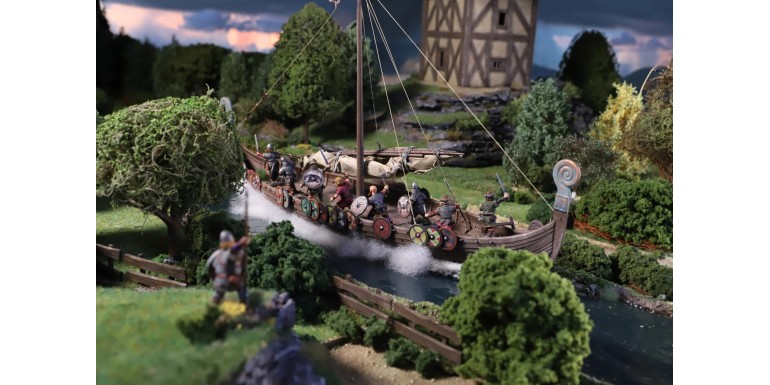
For moving waters (such as rivers, snowmelts, or canals), you need to indicate direction. This is achieved through surface textures, ripples along the banks, small crests, and areas where the water breaks against rocks, wooden pilings, or roots. If everything is left completely flat, it won't look like a current—it will look like glass.
-
For waves, shorelines, or crashing surf, the difficulty increases. You have to build volume, crests, and foam in a credible way. In these cases, it usually works best to model the main body of water first and leave the foam for the very end, applying it with extreme moderation. Excessive foam is one of the most common mistakes in hobby scenery.
Materials and When to Use Each One
Not all water products serve the same purpose. Choosing the right one helps you avoid cracks, shrinkage, and wasted time.
Two-Component Epoxy Resin
This is highly useful when you are looking for actual physical depth, especially in rivers, canals, and deep pools that require a pour of several millimeters. It provides excellent transparency and body, but demands control. If you pour it too thick all at once, you risk trapped bubbles, overheating, or irregular curing. Additionally, any micro-leak in your terrain will force you to repair a piece that has already been fully painted.
One-Component Water Effects
These products usually work best for thinner layers, puddles, calm surfaces, or final touch-ups. They are much easier to use and, for many miniature bases and gaming scenery pieces, are more practical than a deep resin pour. On the downside, they tend to shrink slightly as they dry, so they sometimes require multiple applications.
Transparent Gels and Water Pastes
These are best reserved for surface texture. They are ideal for creating waves, ripples, wakes, and localized movement. They do not work well as a substitute for a deep body of water, but they are highly effective for breaking up an overly flat surface.
Gloss Varnish
Gloss varnish can help with tiny puddles or damp areas, though it has its limits. If used as a universal water solution, the result usually falls short. Shine is not the same thing as water.
Terrain Preparation: Where the Result is Won or Lost
The foundation of your water effect must be completely enclosed, sealed, and designed to contain the liquid product. If the riverbed is made of cork, foam, or porous putty, it is vital to seal it thoroughly beforehand. A single micro-leak is enough to ruin an entire pour.
Next comes the relief. The bottom shouldn't be a uniform ditch unless you are modeling an artificial canal. In natural rivers and ponds, small variations in height help the eye read the depth. It is also best to define the banks, sediment zones, semi-submerged stones, branches, or vegetation before adding the water. Integrating these elements afterward usually looks far too artificial.
The transition between land and water deserves special attention. In nature, there is rarely a perfectly clean cut. A bit of moisture on the shoreline, darkened mud, reeds, or built-up debris helps the water look like an organic part of the terrain rather than an afterthought.
The Background Color Matters More Than the Clear Product
A good realistic water effects guide will always emphasize this: the primary color of the water is almost never in the transparent layer itself, but underneath it. The painted background is what truly provides the sensation of depth and controlled murkiness.
In practice, deep areas benefit from darker tones: muted greens, cold browns, bluish-greys, or even near-black in the deepest corners. The shorelines and shallow areas work best with earthy tones, soft greens, or wet sand. The transition should be gradual unless the scene specifically demands otherwise.
If you decide to add tint or pigment to your transparent product, do so with extreme moderation. Too much tint kills the transparency and turns your water into colored plastic. In gaming projects, where the piece is viewed from a distance, a very light tint can help. For display pieces, however, less is almost always more.
How to Apply Layers Without Ruining Transparency
The safest approach is to work in thin pours. Even if the manufacturer states that the product allows for thick layers, in small and medium-scale scenery it usually pays off to go slowly. Each layer allows you to correct mistakes, check for bubbles, and adjust the tone gradually.
You can minimize bubbles by mixing without whipping, pouring slowly, and avoiding stirring the product once it has been applied. If bubbles do appear, it is best to deal with them early. Waiting too long can leave trapped marks that will never disappear.
If you are aiming for depth, do not fill the basin all the way to the top right from the start. Leave some room for the surface texture and for blending the water into the shoreline. This small final margin gives you plenty of room to play with so that the water doesn't end up looking completely flat.
Ripples, Currents, and Foam Without Overdoing It
Movement has direction. If the river flows from left to right, the surface texture must follow it. It sounds basic, but hobbyists often add random ripples that create visual confusion. Small crests, repeated logically and packed tighter around obstacles, usually work much better than large peaks.
Foam appears where water hits, falls, or compresses. Rocks, waterfalls, boat hulls, pilings, sewer outlets, or banks experiencing strong currents are reasonable places for it. In calm water, foam is almost completely unnecessary. Applying it out of habit makes everything look like the open ocean.
For foam, use less quantity and focus on better placement. A pure white across the entire crest looks too harsh; it usually works better to start with a translucent or greyish base and reserve the cleanest white for very specific impact points. This restraint provides far more realism than a solid, continuous white line.
Common Mistakes to Avoid
1. Using saturated blue for any body of water: In high fantasy this might make sense, but for most historical, grimdark, or realistic tables, water reflects the soil, depth, and environment. A bright blue instantly makes it look artificial.
2. Forgetting the context: A puddle in a battlefield trench shouldn't look as clean as a garden fountain. The water needs to fit the story of the piece: mud, fallen leaves, rust, grime, or stagnant residue can be more important than the shine itself.
3. Trying to finish everything in a single session: Many problems arise from touching the piece too early, adding texture over a layer that hasn't fully cured, or gluing down vegetation while the surface is still settling. In this hobby, patience isn't workshop posturing—it is a fundamental part of the process.
4. Overusing the product: On small bases, a single well-placed puddle often looks much better than converting half the base into a lake. If the water effect distracts from the character or covers up useful detail for gameplay, you may have gone too far.
When Is the Extra Effort Worth It?
Not every project requires the same level of dedication. For a central terrain piece on a narrative gaming table, it is absolutely worth combining resin, tints, gels, vegetation, and foam. On a squad of infantry with muddy bases, however, some glossy mud, a few thin puddles, and well-painted transitions are usually more than enough.
Finding that balance between your creative ambition and the actual practical use of the piece matters a lot. If the scenery is going to travel, take hits, or be stored in stacks, an overly complex or fragile surface might end up damaged. Sometimes a slightly simpler but highly durable solution is the best choice for frequent gaming.
At Terrainandminis.com, this kind of criteria is what makes the difference between buying on impulse and choosing materials that truly fit the piece you are building. You don't need to use every product available; you just need to use the right one.
If you want your water to work, view it as an organic part of the terrain rather than an independent special effect. When the background color, transparency, texture, and riverbank all tell the same story, the result stops looking like an applied chemical and starts looking like real water.