
 Español

Best Blood Effects for Miniatures: Guide & Techniques
- 11/07/2026 08:00:54
- Home , Assembly and Painting Guides
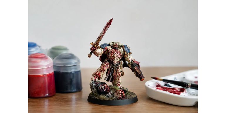
A miniature can feature perfectly highlighted armor and a impeccably detailed base, but a poorly placed splash of blood can ruin the final result in seconds. If you have been searching for the best blood effects for miniatures, the key isn't using the brightest red on your paint rack: it’s about choosing the right texture, tone, and application technique for your scene.
Blood effects work exceptionally well on skirmish warbands, dark fantasy armies, survival horror figures, and narrative dioramas. They can also add gritty realism to a post-battle base or give context to a weapon. However, it is a visual effect with immense weight. Used sparingly, it draws the eye and tells a story; overused, it buries your paint job under a blob of red paint.
What Makes the Best Miniature Blood Effects?
The right product depends entirely on the type of blood you want to depict. Freshly spilled blood reflects light, has volume, and features a deep crimson tone with a subtle dark undertone. Dry blood is matte, brown-tinted, and blends naturally into fabric, soil, and porous surfaces. Impact splatter has sharp, directional edges, whereas an open wound requires a controlled buildup right at the cut.
Because of this, a single bottle rarely covers every application. To achieve a believable finish, it helps to combine acrylic paints, high-viscosity effect gels, and—when the project calls for it—gloss varnish. This isn't about overcomplicating your workflow; it's about making sure fresh blood, dried gore, and bloody mud don't all look identical.
Scale also dictates your approach. At 28mm and 32mm scale, a droplet that seems tiny on your palette can easily cover half a shoulder pad when viewed up close. On larger miniatures, monsters, or vehicles, you have more room to work with layers, drips, and impact points. Before applying any product to your finished miniature, test the coverage on a spare base, a piece of plastic sprue, or the underside of a base.
Paint, Gel, or Varnish: Choosing the Right Medium
-
Acrylic Paints: The most flexible option. They allow you to mix custom tones for dried blood, glazes over cloth, and subtle stains integrated into rusted metal, leather, or stone. A dark crimson mixed with a reddish-brown makes a far better base layer than a pure primary red. Reserve bright reds strictly for small focal points where you want to simulate fresh moisture.
-
Thick Blood Effects (Gels & Gores): Typically acrylic-based with an integrated high-gloss finish, these save time when you need physical volume. They are ideal for deep cuts, coagulated gore, small puddles, and heavy drips hanging off a blade. Applying them with a toothpick or an old stippling brush offers much better control over buildup than a fine detail brush. Their main advantage is ready-to-use gloss; their main risk is that an overly thick layer can look like colored resin rather than realistic blood.
-
Gloss Varnish: Best used as a finishing coat rather than a base. A tiny dot over painted blood restores a wet appearance without muddying the underlying color. Varnishing a large patch of red, however, can make it look flat and plastic. For dried blood, stained cloth, or absorbent earth, a controlled matte or satin finish is far more convincing.
-
Pigments and Powders: Highly effective on bases and terrain elements. Mixed with muted browns and dull reds, they help create contaminated soil, blood-stained dust dragged by boots, or ancient residue on ruins. While not suited for a fresh wound, they seamlessly tie the miniature to its environment.
Tone Matters More Than Bright Red
Real blood does not stay a single shade of red in every situation. On miniatures, you also need to exaggerate contrast slightly so the effect reads clearly from a distance.
-
Dark Maroon/Burgundy: Adds depth and serves as an effective shadow layer.
-
Medium Crimson: Gives body and saturation to the stain.
-
Bright Red: Used in strict moderation to convey fresh moisture.
-
Near-Black Mix: A touch of black-red at the deepest point of a wound or the origin of a drip enhances depth dramatically.
You don't need a five-step mix every time. A dark red base, a brownish-black shadow, and a tiny bright highlight will produce a much richer result than paint straight out of a red bottle.
For aged blood, shift your mix toward deep brown, muted violet, or earthy tones depending on the surface. On a light cloth tunic, a dried stain often displays a reddish-brown rim with a darker center. On polished metal, a fresh splatter tolerates a cleaner, higher-contrast red.
Always consider your miniature's main color scheme as well. On red armor, blood needs a darker shadow layer, localized gloss, or physical texture to stand out. On a figure with cool color tones, a warm red will naturally pull strong visual attention—which is great for a focal point, but should be used strategically.
How to Apply Blood Effects Without Losing Detail
Controlled application starts with narrative intent. Ask yourself where the blood came from and how it moves. A sword freshly pulled from an enemy will show heavy buildup along the edge, droplets near the tip, and perhaps a smear near the hilt. An injured warrior will have blood radiating from a specific impact point, running downward along the armor lines. Even a zombie covered in gore looks more convincing when the spatter follows a logical direction.
Smears and Fabric Stains
Load your brush lightly and wick away excess paint on a paper towel before touching the model. Work in thin layers, expanding the shape irregularly. Avoid perfect circles—real bloodstains fragment, pool in fabric folds, and break up over edges.
Directional Splatters
Restraint is critical here. You can flick paint using a firm-bristled brush or gently tap a loaded brush against a pencil to project micro-droplets. Mask off the rest of the miniature with tape or liquid mask first, and test your splatter pressure on paper. This technique is great for shields, bases, and terrain, but can easily ruin a carefully highlighted face or cape if unmasked.
Drips and Runoff
Use a toothpick, a thin wire, or the tip of an old brush. Deposit a small bead at the point of origin and drag it smoothly in the direction of motion. Vertically, gravity should guide the stroke. On a horizontal weapon mid-swing, combat motion justifies droplets angling outward. A thick, perfectly uniform straight line rarely looks natural.
4 Classic Blood Effects (And When to Use Them)
1. Recent Wounds: Apply dark crimson in the depth of the cut, medium red around the edges, and a tiny spot of gloss gel at the core. Ideal for slashes, bites, and exposed flesh.
2. Bloody Weapons: Concentrate volume along the edge, fullers, and tip. Leave clean metal showing so the weapon doesn't look like it was dipped in paint.
3. Impact Splatter: Use tiny, directional micro-droplets. Best suited for shields, walls, bases, and clothing adjacent to a strike.
4. Dried Ground Stains: Combine red-brown acrylic tones with matte pigments. The perfect solution for dungeon floors, ruined stone, altars, and ancient battlefields.
Bases and Terrain: Adding Context
Blood on a base shouldn't look like an isolated red puddle. Integrating it with stones, mud, scorched grass, sand, or debris grounds the effect into the environment. A small pool naturally collects in cracks between flagstones; a dried stain clings to broken masonry; a bloody footprint requires repetition and consistent direction to show movement.
Scale remains key for tabletop terrain. A dungeon wall doesn't need dozens of large splatters to convey violence. Two or three realistic impact zones supported by fine drops and a dried streak create a stronger narrative. If the terrain piece will see heavy handling during games, make sure to seal thin layers properly so they hold up over time.
Having compatible acrylics, basing materials, textures, and specialized effects in one order makes completing projects much easier. Stocking up on dedicated hobby supplies from a specialized store like Terrainandminis.com ensures your basing textures and miniature paints match the correct scale without relying on makeshift craft supplies.
Common Mistakes to Avoid
-
Applying blood as an afterthought: Always decide on the narrative before opening the paint bottle. Did the character take a hit, strike an opponent, or walk through a bloody zone? That answer dictates placement and volume.
-
Over-varnishing everything with gloss: Blood can be wet, but dried blood and absorbent materials quickly lose their shine. Reserve high gloss for fresh cuts and heavy pooling.
-
Obscuring painted details: Avoid covering up hard-won highlights, squad symbols, faces, or sculpted details. If you are debating whether to add one more drop or stop, stopping is almost always the right call.
Evaluate your work at both tabletop gaming distance and close-up photography distance. If the blood reads as a compelling narrative detail rather than a distraction, you've nailed it. Keep track of your paint recipe—when it's time to paint the next enemy, victim, or piece of scenery, maintaining a consistent visual style will make your army or board look fantastic.